I will always draw by hand, that's how I learned to do art,
that's what I know.
But, in my efforts to grow and always try to learn more, especially the
digital side of things, I wanted to experiment with digital inking.
There are a lot of cool tools and software out there for this but I have lately been checking out a bunch of different online articles and tutorials by some great artists about inking in Adobe Illustrator.
Illustrator is a program that I have used for a long time, but, used more as a graphic software or, if I was doing an illustration I would typically ink the art by hand and then bring into Illustrator. I wanted to try to find something digital that almost looked liked I scribbled it out with a felt tip marker, Illustrator seems to be pretty sweet for this, but unlike Photoshop which is pixel based, Illustrator is vector based
(mathematical points and paths) which is wild, gives you a lot of options as far as setting your brush tool, unlimited re-dos and making quick corrections, It also imports into Photoshop seamlessly to color up.
Here is a quick little exercise I did, nothing special but was a lot of fun, experimented with a lot of crosshatch and dots and just a lot of noise
Tried to pack this to see if all the vectors would bog down the file,
but it did OK, the second photo shows the points and paths.
Much more practice with this to come.
Thursday, September 23, 2010
Sunday, September 12, 2010
Some more stuff from the old sketchbooks
As I mentioned before, there's a lot of stuff I have in my old sketchbooks that I want to post. Some because it's new to me again after being buried for a while, some things I just like, and some because I just wonder what the hell I was thinking?
This post is just that, I like the sketches but, I don't remember what compelled me to doodle this stuff out.
The first image is a few pages of what I guess at the time would be a cool bathroom, why? I don't know. It's obvious I'm no architect,
I remember thinking at the time it would be wild to have this sort of steam punk, no period, shower tower mixed with metals and tiles and sculptures, that you could walk around and set all sorts of
different heads... from water fall to steam, all in this wild bathroom.
The second image is a concept sketch for a play structure proposal that never really went anywhere. The idea was to take one of those toys that you see in almost every kids play area in the doctor's office lobby,
and make it into sort of this public sculpture and play structure
Wednesday, September 1, 2010
D's Salsa
My good friend Danielle who lives deep down in Texas is a hell of a cook, and when she started whipping up batches of fiery hot salsa she started to develop quite a following of fans.
Even the people who can't stand the heat couldn't stop eating it,
asking her if she could make a mild version of the Delicious stuff.
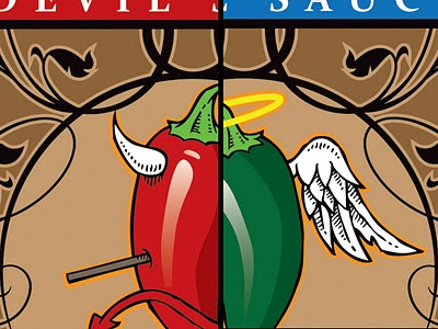
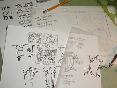
Thus, Dani has created her Devil and Angel sauces, and she asked me if I could design her some labels... a pepper with horns and a pepper with a halo and wings. Here are my designs, I wanted her to have something really different that would stand out from everything else,
hope they can stand up to the goodness in the jars!
For information on ordering some for yourself, click here.


Subscribe to:
Comments (Atom)


